This week Roland Harwood asked this question on LinkedIn:
What (or who) have you changed your mind about recently?
I heard this question the other day which got me thinking and I found it very hard to come up with an answer, which I don’t think is a good thing.
My answer was around taking a position on politics or other areas of controversy:
Had a great conversation with someone else who also works with listed company CEOs, about changing roles for CEOs, particularly about political issues a s taking a stance. Has me pondering about being apolitical or not as a business leader.
So, am currently musing on taking a political position as a business leader. As the person who has me pondering this said, “increasingly to not take a position is seen as taking a position”.
This brings me to Professor Scott Galloway, someone I have followed for some time. Always opinionated, he often can upset people who don’t agree with him, but he is also often right in his opinions. He has now also founded Section 4, a way to learn from him and others in online courses run as sprints.
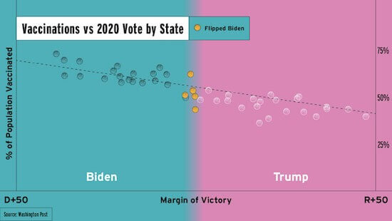
In addition to his brilliant and often very personal weekly newsletters, Section 4 now sends out a “Chart of the Week”. This one in particular reminds me of the power of visuals to tell a message simply and quickly.
What does this one make you feel? Does it land that Scott is being political? Taking a position on something that he should stay out of? Or, is he simply noting something of relevance that he can back up with numbers? Both?
Oh, and though “correlation is not causation” is a key message for statisticians to remind any of us who look to communicate with numbers (and charts!), this one is clearly closely correlated, as the email accompanying the chart noted:
A great indicator of your state’s vaccination rate? How red or blue it is.
– The relationship between a state’s vaccination rate and its 2020 voting pattern is very strong.– The correlation coefficient between them is 0.87. A perfect correlation would have a coefficient of 1.
– With a great margin of Trump victory comes less vaccinations and … more deaths.
from Section 4